So there’s this general trade-off that I continue to think about because I see it show up in all sorts of things, and that’s this seemingly fundamental situation where the more options a given thing has, the harder it is to be understood. The words I’ve just used in that last sentence don’t do justice to the concept, so let’s look at a few examples to elucidate the idea.
Here’s the everyday version first. A professional camera with full manual controls can take almost any photograph you can imagine — but hand it to someone who has never used one and they’ll come back with a blurry mess. A phone camera in “auto” mode gets a good-enough shot for almost anybody, instantly — but try to do something unusual with it and you can’t, because the choices were already made for you. More control, harder to use. Easier to use, less control. That is the whole trade-off, and once you notice it you start seeing it everywhere: in software, in churches, in political parties, in science books, in the law. The rest of this chapter is five walks through that one shape.
Software Stratification
Start with an idea I’ve carried around for years: “software stratification”. I don’t know if that’s the right term for it, but it’s what I’m calling it. It’s when someone releases a very general library that allows its users to basically do anything they want within that domain, but because it’s so general, it’s very hard to use. The list of options within the API is so vast that most users get stuck inside the learning curve. So you end up with very few incredible power users that do awesome things with it, and a lot of people trying to use it and quitting before they get anything useful done at all.
What happens from here is some of those power users will create “abstractions” of the general library on top in order to “simplify” common uses. In the process of doing such a thing, one is forced to choose defaults on behalf of the user. In order for them to make thing simpler, they have to reduce the number of options that are available. For every option that they end up taking away in the layer above, they have to “fill in” the required option below with some choice. Their ability to do this, choosing what options to present to the user and what options to choose for them, ends up reflecting the quality of the abstraction.
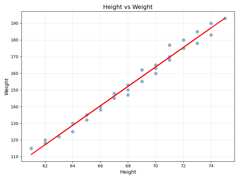
An example of such a thing are two graphing libraries in python: matplotlib being the general powerful one and seaborn being the abstracted easier one. Let’s let the syntax of creating a single scatter plot with a regression line help illustrate the example. Here is the code associated with doing such a thing for both, first for matplotlib:
import matplotlib.pyplot as plt
import numpy as np
from scipy import stats
import pandas as pd

# Assuming we have data
df = pd.read_csv('data.csv')
x = df['height']
y = df['weight']

# Create the plot
fig, ax = plt.subplots(figsize=(8, 6))

# Scatter plot
ax.scatter(x, y, alpha=0.6, color='steelblue', s=50)

# Calculate and plot regression line
slope, intercept, r_value, p_value, std_err = stats.linregress(x, y)
line = slope * x + intercept
ax.plot(x, line, 'r-', linewidth=2)

# Customize appearance
ax.set_xlabel('Height', fontsize=12)
ax.set_ylabel('Weight', fontsize=12)
ax.set_title('Height vs Weight', fontsize=14)
ax.grid(True, alpha=0.3)

# Show confidence interval (requires more complex calculations)
# ... additional 10-15 lines of code for confidence bands

plt.tight_layout()
plt.show()
which will yield the following image:
and now for seaborn:
import seaborn as sns
import pandas as pd

df = pd.read_csv('data.csv')

# Create the same plot
sns.regplot(data=df, x='height', y='weight')
plt.show()
which yields the following image:
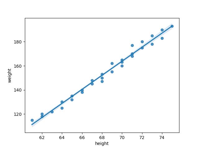
The first thing you should notice is that the amount of code you need to write to produce what is effectively the same plot is drastically different. That’s because seaborn makes many of the choices for you, thus obviating the associated code. In fact, they even added in some things that they felt were useful, like what appears to be standard deviation from the regression (look closely for the blue shading around the trend line).
There’s much to be said about how to make a “good abstraction” for users — a thread for another day. The point here is that seaborn was created to lower the barrier of entry for users so that they can plot things without having to go through the more complicated process of learning how to use matplotlib, but by doing so, it as removed the user’s ability to fully explore what can be done with plotting in python.
They’ve constrained the user’s options for the benefit of increasing overall accessibility.
(In software this is often called being opinionated — the tool has opinions about the right way to do the common thing, and quietly makes those choices for you.)
The same curve in religion
The same trade-off shows up the moment you look at how religions reach people. Take Catholicism before and after Vatican II. The pre-reform Latin Mass is the high-optionality, low-accessibility end of the curve. The ritual carries an enormous amount of doctrinal precision — every gesture, every Latin phrase, every fixed-form prayer points at a specific theological commitment with centuries of qualifications behind it. A practitioner who knows the apparatus has access to the full form of the tradition. A practitioner who doesn’t has very little — they participate in the surface forms without being able to read what the forms are saying. The optionality is real and the precision is real; the access is narrow.
The vernacular Mass that came out of Vatican II is the other end. The liturgy is in the local language; the gestures are simpler; the doctrinal precision is, by design, lower — the ritual stops trying to encode every nuance and starts trying to be participable by people who haven’t trained for it. Access goes up, often dramatically. Doctrinal precision goes down, also dramatically — many of the specific commitments the Latin form encoded are simply not present in the vernacular form, or are present in such generalized language that they could be read several ways.
That’s the same curve matplotlib and seaborn are sitting on. The Latin Mass is matplotlib: powerful, precise, hard to use. The vernacular Mass is seaborn: opinionated, accessible, lower ceiling. And the same person-shaped tension shows up around both pairs — Catholic traditionalists arguing the access-gains didn’t justify the precision-loss; Catholic reformers arguing the precision-gains under Latin weren’t worth the access-loss; everyone agreeing, implicitly, that you cannot have both at once.
The same pattern shows up across other religious traditions: classical Arabic Quranic recitation vs. translated Quran for non-Arabic-speaking Muslims; Talmudic study in the original languages vs. accessible English translations; the strictness gradient inside Judaism from Orthodox to Reform; the gradient inside Christianity from Eastern Orthodox liturgy to evangelical praise music. Every religion that has scaled past its original community ends up making this trade explicitly, often through institutional split. The high-optionality form is preserved by a smaller specialist community; the high-access form reaches the wider audience. Sometimes the two coexist peacefully (some Catholic dioceses now offer both Latin and vernacular Masses); sometimes the split is permanent and contentious (most Reformation-era ruptures); but the curve itself is the same.
The same curve in political platforms
Political parties live on the curve too, and the shape of the curve sets a lot of what looks like “political dysfunction.” A broad-tent national party in a winner-take-all system has to attract a wide enough coalition to win a plurality — fifty-percent-plus-one of voters who don’t agree about anything except who they don’t want to lose to. To hold that coalition together the party has to flatten its platform: avoid specific commitments that any sub-coalition would object to, stay vague on issues where the sub-coalitions disagree, and emphasize the few things they all agree on (often: opposition to the other party). High access (large coalition), low optionality (vague platform that doesn’t commit to specifics).
A narrow specialist party in a proportional-representation system has the opposite shape. It can be specific because it doesn’t have to win a plurality; it just has to clear a threshold to enter coalition negotiations. The Green parties, the various Pirate parties, single-issue parties around housing or pensions — these can have detailed, internally consistent platforms with sharp policy commitments because they don’t have to be acceptable to everyone, just to their constituency. Low access (small coalition), high optionality (precise platform).
The trade is structural and visible in real time. When a broad-tent party tries to take a specific position on a divisive issue, parts of the coalition peel off and the party loses access; when a narrow party tries to broaden its appeal, it loses the precision that defined it and its core supporters defect. No major-coalition party in a winner-take-all system has solved this trade — they all spend their effort managing it. The curve runs the same in every electoral system; what differs is whether the system’s incentive structure rewards staying on the high-access or the high-optionality end.
This connects directly to a question Part IV will return to: the integration project — the book’s eventual prescription (Ch 9) for moving complex truth between groups that don’t share starting points — runs against the high-access end of this curve, because integration requires the precision that broad-coalition platforms structurally strip out. The book’s prescriptions for institutional infrastructure that holds precision have an electoral analogue, and the same trade is operating in both.
The same curve in scientific popularization
The popular science book is seaborn for whatever scientific field it’s drawn from. Stephen Hawking’s A Brief History of Time is the canonical case — a treatment of general relativity, quantum mechanics, and cosmology aimed at a reader with no background in any of them. It is, by acknowledged design, a seaborn-style abstraction: dozens of choices about which technical apparatus to skip, which analogies to substitute for which equations, which qualifications to compress into a single sentence. Hawking and his editor reportedly removed every equation past one (, kept reluctantly), explicitly trading optionality for access. The book has sold over 25 million copies. The actual papers Hawking was popularizing have, between them, probably been read in full by under ten thousand people.
The same curve shows up across every scientific field that has produced popular treatments. Carl Sagan’s Cosmos for astronomy; Richard Dawkins’s The Selfish Gene for evolutionary biology; Sapiens for evolutionary anthropology; the various pop-econ books (Freakonomics, Thinking Fast and Slow) for behavioral economics. Each is a deliberate abstraction that drops most of the field’s optionality to gain access; each reaches an audience the original literature could never reach; each is criticized inside the field for losing precision that the author judged worth losing.
Two things to mark about the scientific popularization case specifically. First, the trade-off here interacts directly with the book’s earlier chapters on transport and selection: the popularization is the compressed form that travels, the technical literature is the complex form that doesn’t, and the curation gates from Chapter 1 are exactly what decides which compression gets popularized. Second, the popular science book is the place where the bridge-node argument from Part IV becomes visible — a good popularization is written by someone who has paired their depth in the field with the metacognitive flexibility to translate it, and the book-as-artifact is the trace of that bridging work. A Brief History of Time worked because Hawking was a deep specialist who also had bridge-node flexibility; many less-good popularizations fail in one direction or the other (too specialist to be readable; or readable but inaccurate because the author lacked depth).
The same curve in legal codes
The clearest version of the trade might be in legal codes. A statute drafted by professional legislative counsel is the high-optionality end — every clause has a specific scope, every defined term has been chosen to interact correctly with hundreds of other defined terms across the entire body of statutory and case law, every “shall” and “may” and “subject to” is doing precise work that a generalist reader cannot see. Read a section of the U.S. Internal Revenue Code or the European Union’s GDPR or any modern environmental statute and the optionality is overwhelming — the precision is real and substantial and the access is, for any non-lawyer, near zero.
A plain-language summary of the same statute is the other end. “GDPR means companies have to tell you what data they collect and let you delete it” is the seaborn version of seventeen articles, ninety-nine recitals, and several thousand pages of case-law interpretation. The summary is accessible; the precision has been almost entirely stripped. A reader who relies on the summary will be wrong about edge cases the original carefully handled — when the data must be deleted, what counts as a “controller” versus a “processor,” when consent is sufficient versus when explicit consent is required. The precision lost was load-bearing in many situations; the summary handles the central case at the cost of being wrong about the periphery.
What’s distinctive about the legal case is that the institutional setup expects both forms to coexist. The statute is the canonical form; the summary is the access form; specialists (lawyers) bridge between them on a case-by-case basis, charging for the bridging work. This is preservation-and-training-in-one-profession, more cleanly than most other domains the book engages — the legal apparatus is structurally committed to both ends of the curve simultaneously, with a professional class whose job is the per-case translation.
It is also one of the cleanest cases of the bridge being captured by the political economy of who can afford the bridge: the precision lives in the statute, the access lives in the summary, and getting the precision applied to your specific situation requires hiring someone whose time costs money. Access to the precision is gated by ability to pay. That is the legal profession’s version of what Chapter 10 will call cost-shifting — when barriers fall, the cost of quality assessment doesn’t vanish, it transfers to whoever consumes — and it’s instructive that even the cleanest institutional bridge between the two ends of the curve produces an access asymmetry that scales with wealth.
What the curve actually is
Stand back from the five domains and the shape is the same: more optionality means more precision but narrower access; more access means broader reach but lower precision. The curve is real, it is structural, and it is the same curve in software, religion, politics, scientific popularization, and law. I think it is the same curve everywhere, though the chapter is making a strong claim there and I want to flag it as a claim rather than a survey.
The reason the curve recurs across such different domains is that it is reflecting something about the receiver, not about the domain. Every reader / believer / voter / lay scientist / non-lawyer has a finite receiver budget (Ch 3) and a finite stock of pre-existing structure they can hook new content onto. The optionality end of the curve is precise because it encodes distinctions that require pre-existing structure to decode; the access end is broad because it has been compressed to fit inside the structure most receivers already have. The optionality-vs-access trade isn’t a property of any particular medium or domain — it is the receiver-budget constraint reflected in the artifact’s design. Whatever form an idea takes has to be designed against the receiver budget it is trying to reach, and the trade between precision and reach is the visible consequence of that constraint.
That reframe ties the chapter into the rest of the book’s argument cleanly:
- For Chapter 5, optionality-vs-access is the receiver-side mechanism behind the complexity-virality trade-off. Complex (high-optionality) forms have low reach because they exceed the receiver-budget of most receivers; viral (high-access) forms have low precision because they have been designed to fit inside small receiver-budgets.
- For Chapter 8, the optionality-vs-access pattern is structurally what preservation-and-training is for: preservation institutions hold the high-optionality form, training institutions expand receiver-budgets so more people can access the high-optionality form. The Latin Mass / vernacular Mass split is exactly this pair operating in real institutional time.
- For Chapter 11, decompression-on-demand is the first technology in history that could in principle let a single artifact serve both ends of the curve — high optionality available to those who want it, high access available to those who don’t, with the LLM handling the per-receiver translation. The salvation case Ch 11 sketches is, in optionality-vs-access terms, the possibility of stepping off the curve entirely for the first time.
What the curve is not
A caution, because the phrase “lots of options” has been quietly doing two different jobs in this chapter, and they need pulling apart. The curve above is a claim about artifacts — tools, libraries, liturgies, statutes, popular books. It is the approachability trade-off of a designed thing: how much of a domain’s precision the artifact preserves, set against how easily a given receiver can pick it up. That is all it is. It is not a claim about the domains those artifacts point into, and the two are different animals.
An artifact has a top. matplotlib is enormous and brutal to learn, but it is finite and masterable — the software-stratification section turned on exactly that, on the fact that power users exist, people who have reached the top of that learning curve and command the whole library. The domain matplotlib points into — everything you could ever express by turning data into a picture — has no top, and nobody commands it. That bottomless thing is what I work through in a separate piece, the abyss: the possibility space of a sufficiently complex field, so vast it cannot be navigated by anyone, and which takes real competence even to perceive is there. A software library is not an abyss. The library is a finite map; the abyss is the territory the map is of.
State the relationship precisely, because “lots of options” describes both and that is exactly the trap. A tool’s optionality is a learning curve with a summit; a domain’s abyss is a horizon with none. Optionality-vs-access is the trade-off you make when you draw a map — when you compress an unnavigable domain into a finite artifact a budget-limited receiver can actually use — and the abyss is why you are forced to draw one at all. So this curve sits downstream of the abyss: it is one face, the artifact-design face, of the compression that a finite receiver budget meeting an un-navigable domain makes unavoidable. This chapter names the curve. It was never meant to name the whole landscape.
Where I land
The trade-off, said plainly: every artifact that carries an idea has to be designed against its intended receivers’ budgets, and the budget constraint produces the same curve everywhere — high optionality buys precision at the cost of access; high access buys reach at the cost of precision; you cannot have both at once for a given artifact. Different domains differ in how the trade is institutionalized — religions through ritual stratification, politics through party-system incentives, science through popularization, law through professional translation — but the curve is the receiver-budget constraint refracted into design choices, and it is the same curve in every case.
The chapter’s contribution to the book is small but load-bearing: it puts the receiver-budget constraint into the design of artifacts directly, so the rest of the book can refer to “optionality vs. access” as shorthand for the artifact-design version of receiver-budget thinking. Whenever a later chapter says “the popular form gains reach at the cost of precision,” it is invoking this curve; whenever it says “the technical form preserves precision at the cost of reach,” it is invoking the same curve from the other side. The chapter is doing the work of naming the curve so the rest of the book can use it.
Where I’m still uncertain
-
The “same curve everywhere” claim is strong and I have surveyed only five domains. Software, religion, politics, scientific popularization, and legal codes are all cases where the curve runs as described. I have not surveyed cases where it might not run — domains where high optionality and high access can in fact be sustained together (perhaps mathematical proof, where the optionality is precise but the access scales with training and there is no apparent ceiling on either). A more careful version of the claim might be that the trade-off is structural under most conditions but breakable under specific institutional setups, and the chapter has not worked out what those exceptions look like.
-
The “receiver-budget reflected in the artifact” framing may understate the medium’s role. The chapter blames the curve on the receiver-budget, but the medium also imposes its own constraints (a 280-character medium cannot carry high-optionality content even if every receiver has the budget for it). The honest version of the framing is probably receiver-budget and medium-capacity jointly, and the chapter has simplified.
-
The decompression-on-demand “step off the curve” claim is provisional and depends on Ch 11/12’s conditions. I have written it as the optimistic possibility, but it requires the LLM political-economy conditions Ch 11/12 say are economically marginal. The honest reading is that the curve is still binding in the modern environment, with decompression-on-demand as a hypothetical exit conditional on infrastructure that does not yet exist at scale.
-
The legal case’s wealth-gated access is a darker pattern than the other domains. Software, religion, politics, and scientific popularization all have versions of the curve where the access end is broadly available even if the optionality end is professionally gated. The legal case has the wealth-gated bridge between them as a structural feature, and that is a different and more troubling pattern than the others share. Whether the wealth-gating is unique to law or whether the other domains have analogous patterns the chapter has missed is something I have not engaged.
-
The chapter’s voice is the looser register from earlier in the book and does not match the Part IV voice. That asymmetry is shared with Ch 3 and was flagged there. Whether to harmonize across a polish pass is open.